Building a Corporate Digital Platform
for an Infrastructure Leader
Cemex Project Integrated operates in a sector where credibility is the contract. Nexora was engaged to build a digital platform that matched the scale and sophistication of the company's physical operations — transforming a fragmented web presence into a structured, enterprise-grade corporate experience capable of communicating the depth and capability of a serious infrastructure firm.
When Your Operations Are Enterprise-Grade, Your Digital Presence Has to Match
In the Nigerian construction and infrastructure sector, corporate website quality is a credibility signal — one that prospective clients and institutional partners evaluate before a single meeting is scheduled. Cemex Project Integrated operates across power, marine, construction, facility management, solar, and vehicle services. The challenge was building a digital presence that communicated the full scope of that multi-sector capability without overwhelming visitors — and that felt as sophisticated as the company's physical operations.
Nexora was brought in to design and build a premium corporate platform from the ground up. The visual direction was deliberate: a dark industrial theme — carbon black and graphite backgrounds, industrial gold accents, cinematic infrastructure photography — inspired by the visual language of global engineering giants like Siemens Energy, GE Vernova, and Bechtel. The result is a platform that communicates technical capability and commercial sophistication in the same breath.
- Build a dark-mode premium design system (carbon black, graphite, industrial gold) that positions the company among global infrastructure leaders
- Create a multi-service architecture covering power, marine, construction, facility management, solar, and vehicle verticals — clear without being overwhelming
- Design a cinematic hero with glassmorphism statistics panel and a modular gold-accented card system for service and product presentation
- Deliver a B2B lead generation structure optimised for the time-constrained procurement evaluator
Communicating Enterprise-Scale Capability Without Losing Clarity or Credibility.
Infrastructure and construction companies face a specific UX challenge that consumer brands do not: their audiences are sophisticated, time-constrained, and evaluating multiple vendors simultaneously. A corporate website in this sector isn't marketing collateral — it's a due diligence tool. Procurement managers, project owners, and institutional clients arrive at a corporate website with specific questions, and if those questions aren't answered quickly and credibly, the company is deprioritised before the relationship has even begun.
Multi-Service Communication Complexity
Cemex Project Integrated's service portfolio spanned multiple distinct verticals — construction and civil works, procurement and supply chain, facility management, and industrial services. Presenting these on a single corporate platform without creating confusion, visual clutter, or navigation paralysis required a service architecture strategy that could make each vertical feel appropriately prominent without competing with the others for attention. This is a significantly harder information design problem than single-service corporate sites face.
Credibility Signalling in a High-Stakes Decision Environment
In B2B infrastructure services, the visual quality and structural sophistication of a company's digital presence is interpreted as a proxy for operational quality. A poorly structured website in this sector doesn't just fail to impress — it actively damages the credibility assessment of an otherwise capable company. The existing platform wasn't projecting the confidence or capability that the company's track record warranted, creating a discrepancy that was costing them in first-impression evaluations.
Scalability Without Architectural Debt
Infrastructure businesses expand their service offerings over time. A platform built without scalability in mind becomes an obstacle to growth — content teams are forced to work around structural limitations, new services can't be added cleanly, and the eventual cost of a rebuild far exceeds what good architecture would have required upfront. Cemex Project Integrated needed a CMS and page architecture that could accommodate growth without technical debt accumulation.
"In B2B infrastructure, your website is evaluated like a project tender. Clients aren't reading your copy — they're using the visual quality, structural precision, and information clarity to infer what your team will be like to work with. The design is the first deliverable."
Credibility Architecture as the Foundation of Every Design Decision
Nexora's discovery process for Cemex Project Integrated began with a stakeholder audience analysis — mapping the distinct decision-maker profiles who would visit the platform and understanding what each of them needed to see, in what order, to reach a positive credibility assessment. The architecture wasn't designed for a generic visitor. It was designed for a procurement officer evaluating a shortlist, a project owner validating a referral, and a facilities manager researching service capabilities. Each of these audiences had different entry points and different information requirements.
Dark Industrial Theme as Competitive Positioning
The decision to build in dark mode was strategic, not aesthetic. Most Nigerian construction company websites default to light corporate templates — blues, whites, stock photography. CEMEX Project Integrated needed to look categorically different. The carbon black and graphite design system places the platform in the same visual tier as Siemens Energy, Fluor, and GE Vernova — global engineering brands that the company's target enterprise clients already trust. The brand impression is set before a single word is read.
Information Architecture Optimised for B2B Lead Generation
The homepage follows the structure proven by enterprise B2B platforms: hero with company positioning → statistics panel (proof of scale) → services overview (capability breadth) → products section → CTA panel. This sequence answers the four questions every procurement evaluator arrives with — who are you, what do you do, how big is your operation, how do I engage you — in under ninety seconds without requiring navigation. The information architecture is a funnel, not a brochure.
Gold CTA System for Conversion Clarity
All primary CTAs use industrial gold (#F4BE2A) on black text — high contrast, immediately scannable, clearly actionable. Secondary CTAs use a transparent background with a white border at 20% opacity. This two-tier CTA system ensures a visitor always knows the primary action Nexora wants them to take (Request Quote / Get Started) without competing visual noise. Gold becomes synonymous with action throughout every section of the platform.
Our Process
Stakeholder Audience Mapping & Decision Flow Analysis
Identification of the distinct decision-maker profiles visiting the platform — procurement, project ownership, facilities management — and mapping of the specific information each requires to reach a positive credibility assessment.
Service Architecture & Information Hierarchy Design
Structuring of the multi-service portfolio into a clear navigational and presentational system — service categories, individual service pages, capability depth, and project portfolio integration — without creating visual competition between verticals.
Corporate Visual Identity & UI/UX Design
Enterprise design system built around authority, precision, and visual confidence. Typography, colour system, spacing, and component hierarchy all calibrated to communicate institutional credibility rather than consumer appeal.
Frontend Development & CMS Architecture
Performance-optimised frontend with scalable CMS architecture — service pages, project portfolio, and team content structured as repeatable content types that the company can expand without developer involvement.
SEO Foundation, Analytics & Launch
Semantic HTML structure, meta architecture, and structured data implementation for search visibility. Analytics configured to track service page engagement, contact form submissions, and portfolio section interaction — providing ongoing performance data for content optimisation.
Authority Through Precision — An Enterprise Design Language
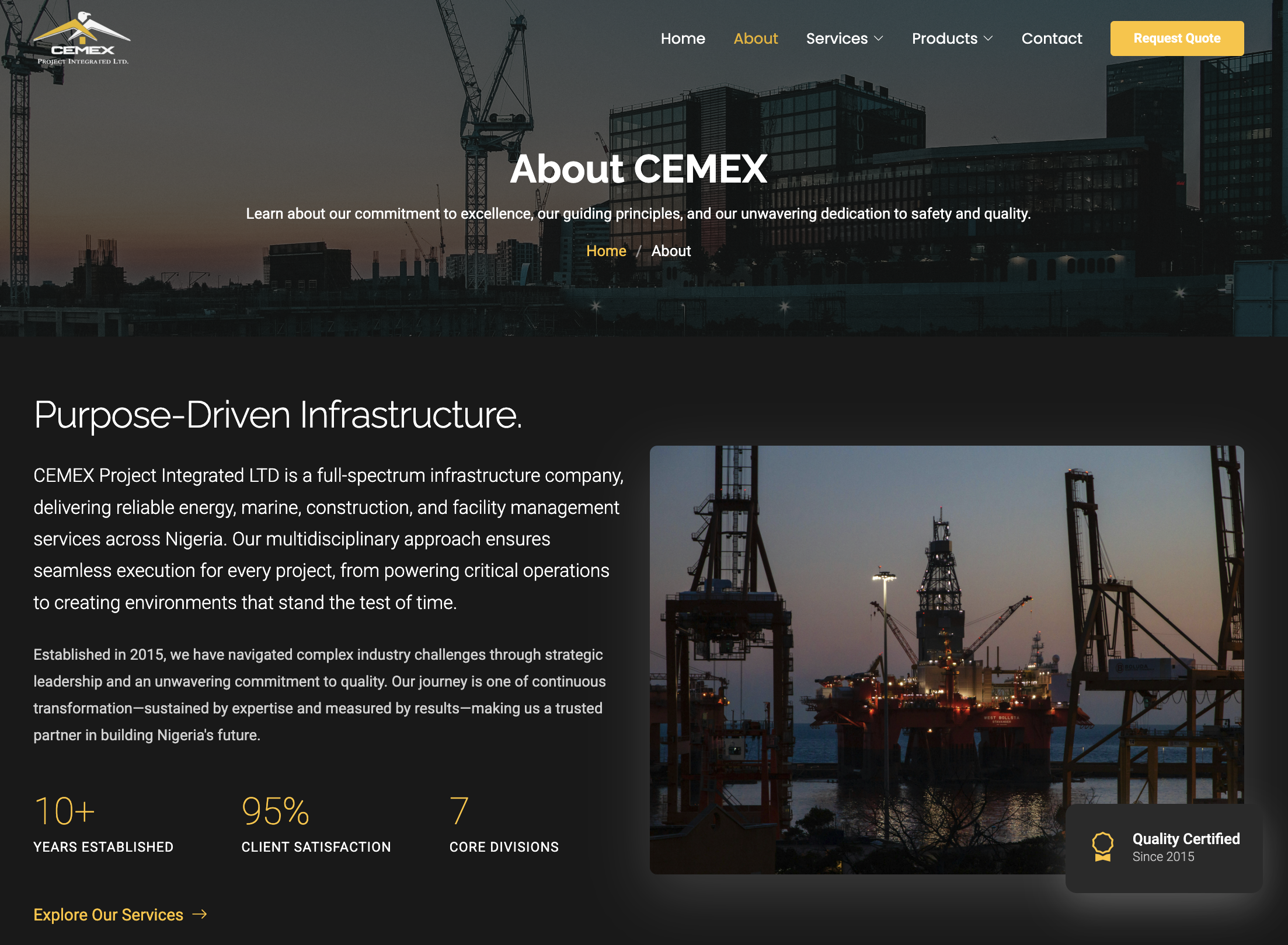
The visual language for Cemex Project Integrated was built around a single design principle: look like a global engineering firm, not a regional contractor. The entire interface operates on a dark industrial theme — the same visual register used by Siemens Energy, GE Vernova, and Bechtel — where carbon black backgrounds and graphite surfaces create the backdrop against which industrial gold becomes the decisive visual anchor. The 70/20/10 colour hierarchy (black/graphite · white · gold) produces the luxury-inspired balance seen across premium infrastructure brands globally.
Colour System
Typography
The type system uses a geometric modern sans — Inter, Manrope, or DM Sans — at weights and sizes calibrated to communicate authority at scale. Hero headlines run at 56–72px, weight 700, tight line-height — matching the visual weight of large-format infrastructure photography. Section headings step down to 36–48px. Uppercase label text with 0.08em letter-spacing appears throughout statistics, navigation, and service metadata. The system feels closer to high-end SaaS or energy sector branding than to traditional construction company typography.
Design Principles
Cinematic Hero System
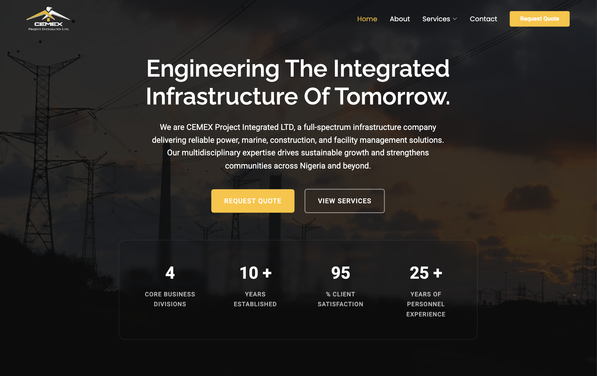
The hero follows a cinematic industrial pattern: large infrastructure photography (transmission towers, energy assets, construction sites) treated with a 70% dark overlay that improves text contrast while reinforcing premium drama. The statistics panel sits over the hero as a glassmorphism layer — rgba(255,255,255,.05) background, backdrop-filter: blur(10px), and a 1px white border at 8% opacity — modernising the industrial brand with a contemporary SaaS-adjacent aesthetic.
Gold as the Visual Anchor
Industrial gold (#F4BE2A) appears on buttons, icons, statistics, navigation highlights, and hover states — making it the single most visible colour on every screen. This disciplined 10% colour allocation creates maximum visual impact without overwhelming the dark background. Every CTA, statistic value, and service icon draws the eye through gold before text is read.
Modular Card Architecture
Service and product cards share a unified visual language: graphite (#1E1E1E) background, 12px border radius, 32px padding, gold circular icon (48px, 50% border-radius), and a translateY(-4px) hover lift with shadow increase. This consistency across all card types creates the impression of an enterprise-grade design system — the same visual discipline a sophisticated client expects from a company managing complex infrastructure projects.
Designed for the Decision-Maker Who Has Twelve Tabs Open
Corporate B2B visitors are not leisurely browsers. They are task-oriented, time-pressured, and comparing your platform against competitors with identical intent. The UX architecture for Cemex Project Integrated was built around this reality — making it possible for a procurement evaluator to understand the company's full capability and reach the contact mechanism in under ninety seconds, while simultaneously providing the structural depth for a visitor who wanted to spend fifteen minutes in detailed research.
Homepage: Rapid Credibility Assessment
The homepage was engineered to answer the four questions every corporate B2B visitor arrives with: Who are you? What do you do? How large is your operation? How do I start a conversation? The hero section answered the first two. The service overview answered the third. The CTA infrastructure answered the fourth. All four were resolvable above or near the fold on desktop, without requiring navigation or extended scroll. This efficiency communicates operational confidence before a single service page has been read.
Service Discovery: Clear Pathways, No Dead Ends
Service discovery was designed as a two-layer system. Layer one: service category navigation accessible from the homepage and top-level navigation, providing a high-level map of the company's portfolio. Layer two: individual service pages with their own internal structure — scope, deliverables, relevant project context, and contact entry point — allowing a visitor who landed on a specific service page from search to get everything they needed without returning to the homepage. No dead ends. No navigation required to progress.
Mobile: Corporate Experience Without Compromise
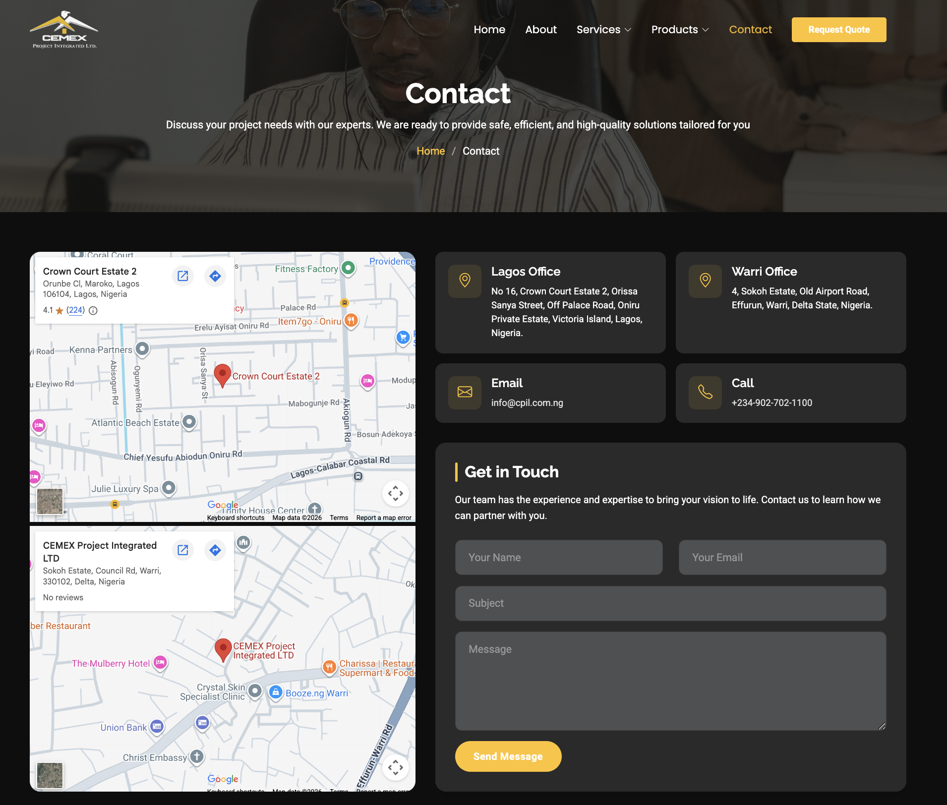
Senior decision-makers in the Nigerian market frequently access corporate platforms on mobile during or between meetings. The responsive system was designed to maintain full information depth on mobile — not a stripped-down version of the desktop experience, but an equivalently capable one restructured for a vertical viewport. Navigation collapsed to a structured mobile menu, service grids refolded to single-column card layouts, and contact forms adapted to native mobile input patterns.
The Systems That Positioned Cemex Project Integrated as an Enterprise-Grade Digital Operation
Cinematic Hero with Glassmorphism Stats Panel
What was built: A full-viewport hero with industrial infrastructure photography treated with a 70% dark overlay. Above it, a glassmorphism statistics panel — translucent white at 5% opacity with 10px backdrop blur and a subtle white border — presenting key metrics (client satisfaction, project count, years of operation) in 42px bold gold typography against the cinematic background.
The combination of cinematic photography, dark drama, and a glass-effect stats overlay is the specific visual pattern that positions CEMEX Project Integrated in the same tier as global engineering brands — before any service content is read.
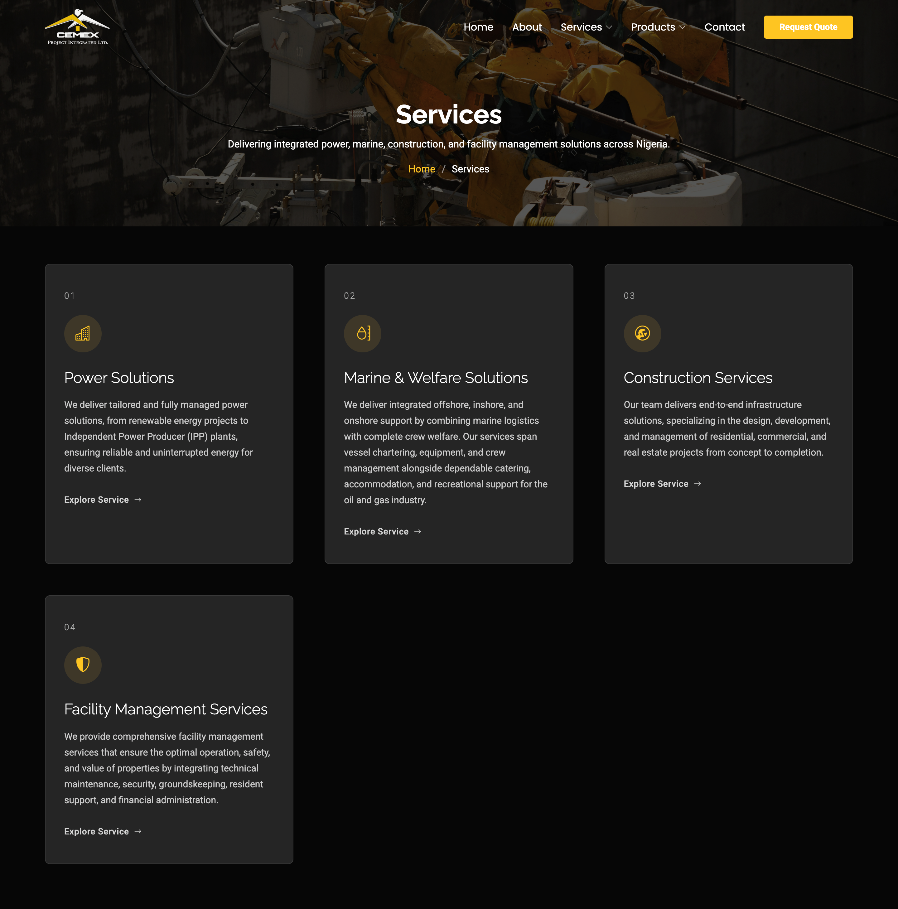
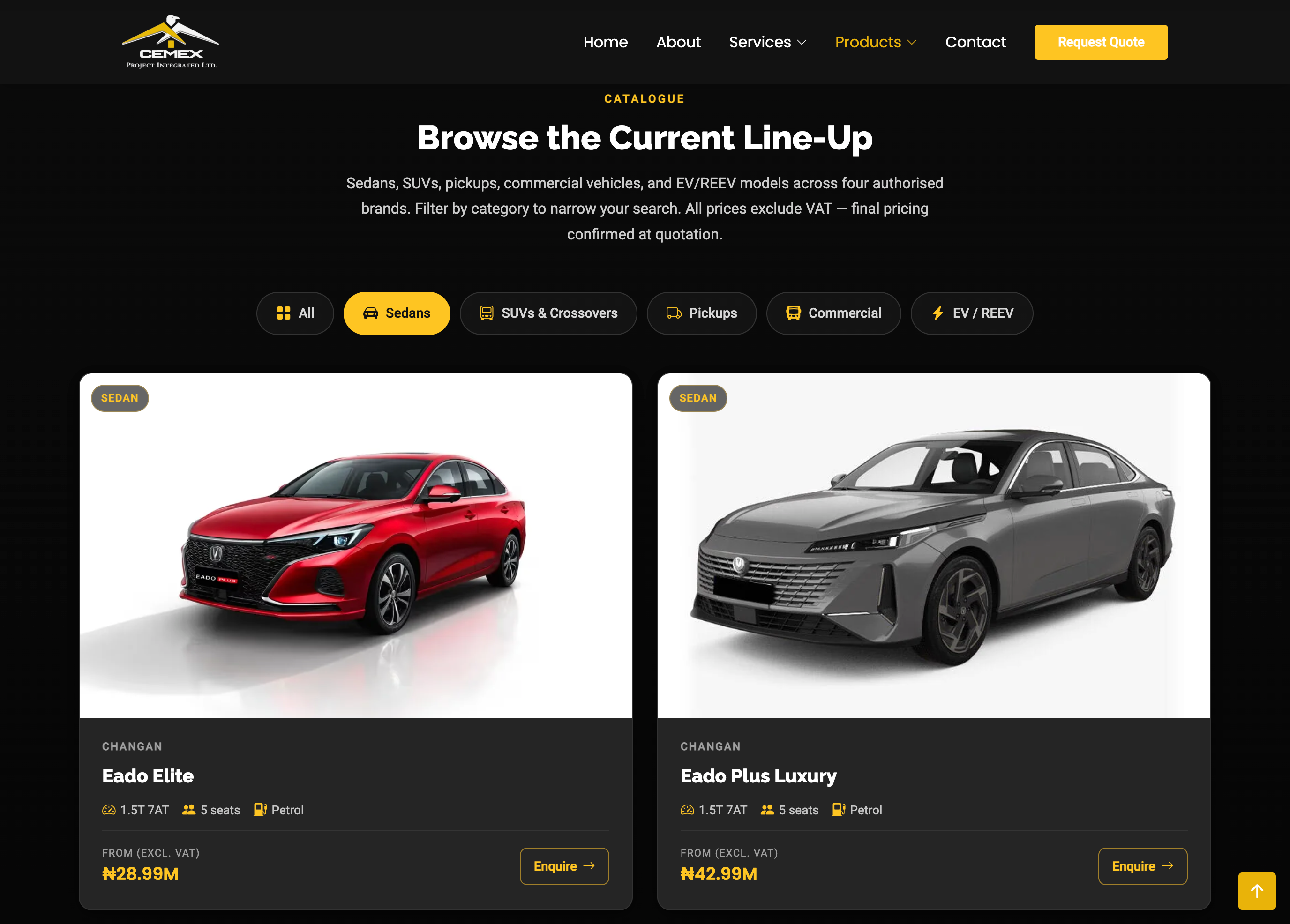
Six-Vertical Service Card System
What was built: A 3-column card grid covering Power, Marine, Construction, Facility Management, Solar, and Vehicle services. Each card features a graphite (#1E1E1E) background, 32px padding, a numbered heading, a 48px circular gold icon, title, description, and arrow link. Hover state lifts the card 4px with increased shadow depth.
The numbered sequence (01–06) and consistent visual treatment across all cards communicates operational breadth without creating visual competition between verticals — each service feels equally prominent and professionally presented.
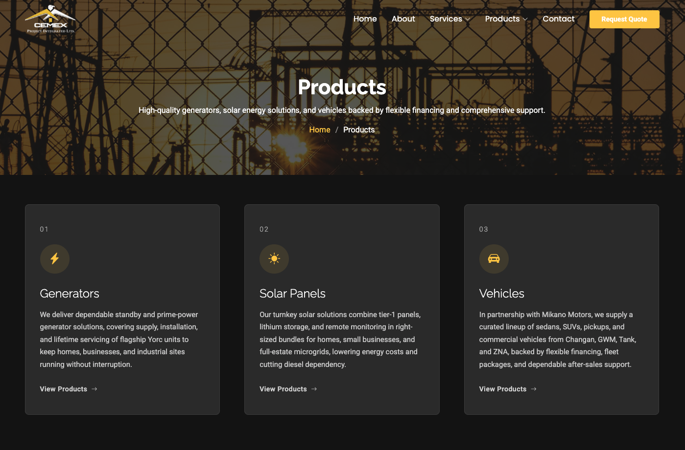
Products Showcase Section
What was built: A products section following the same card architecture as services — graphite backgrounds, gold icons, consistent padding — maintaining visual cohesion between service offerings and equipment or product capabilities. The identical card language across both sections reinforces the impression of a unified, systematically designed platform.
Separating services from products within the same visual system allows enterprise clients to understand both what CEMEX does (services) and what it uses or supplies (products) — two distinct but equally important capability dimensions for a procurement evaluator.
Gold CTA Architecture
What was built: A two-tier CTA system deployed throughout every section. Primary CTAs (Request Quote, Get Started) use industrial gold (#F4BE2A) fill with black text and 8px border radius. Secondary CTAs (View Services, Get In Touch) use transparent background with a white border at 20% opacity. Hover states apply scale(1.02) to primary buttons.
Gold CTAs against dark backgrounds achieve extreme contrast ratios, making every call-to-action scannable from across the page. A visitor never needs to search for the next step — the gold directs them to it.
Dark-Mode Statistics Components
What was built: Standalone statistics blocks deployed in the hero and throughout the page — large number at 42px bold gold, supporting label at 12–14px uppercase with letter-spacing — presenting client satisfaction, project completion, and operational scale metrics as the primary proof layer.
In B2B infrastructure, numbers communicate what prose cannot. A 95% client satisfaction rate or a decade of project delivery history, presented in gold at 42px, reads as a credential rather than a claim — and credentials convert procurement evaluators.
High-Contrast Enterprise Typography
What was built: A typographic system in Inter or Manrope — geometric, modern, corporate — running hero headlines at 56–72px / weight 700, section headings at 36–48px, card titles at 20–24px, and body at 15–18px. White (#FFFFFF) for headlines and key content, soft gray (#B5B5B5) for body and secondary content, gold for statistics and accents.
The white-on-carbon-black contrast ratio far exceeds WCAG AA requirements and produces the high-contrast enterprise readability associated with premium dark-mode SaaS and energy sector platforms — reinforcing the company's positioning at every scroll depth.
An Enterprise Stack Built for Long-Term Scalability and Content Independence
The technology choices for Cemex Project Integrated were governed by one core requirement: the dark industrial visual system had to be delivered without performance compromise to a Nigerian enterprise audience that frequently accesses corporate platforms on mobile under variable data conditions. That ruled out heavy JavaScript frameworks and required a clean, dependency-light frontend that could deliver the premium dark-mode experience with fast initial render times.
Frontend Build
- HTML5 and CSS3 — the entire design system (carbon black backgrounds, graphite cards, gold accents, glassmorphism stats panel) implemented in CSS custom properties without framework overhead
- CSS custom properties for design tokens —
background: #050505,surface: #1E1E1E,primary: #F4BE2Adefined as variables and applied consistently across all components for visual coherence - CSS Grid 12-column layout system — 3-column service/product card grids on desktop, 8-column on tablet, 4-column on mobile, with no layout breakage across device sizes
- Backdrop filter glassmorphism — the hero statistics panel implemented with
background: rgba(255,255,255,.05),backdrop-filter: blur(10px), andborder: 1px solid rgba(255,255,255,.08) - Vanilla JavaScript — scroll-triggered fade-up animations, hover lift interactions (
translateY(-4px)), and CTA scale effects (scale(1.02)) without framework dependencies - Performance-optimised imagery — industrial photography compressed and delivered at appropriate sizes per breakpoint, with lazy loading below the fold to protect initial render speed
Design System Implementation
- Dark overlay system — hero photography treated with a 70% black overlay applied via CSS pseudo-element, maintaining image depth while ensuring headline legibility at 56–72px
- Service card component — graphite background, 12px radius, 32px padding, 48px circular gold icon, numbered heading, consistent hover shadow depth — built as a reusable CSS pattern deployed across both services and products sections
- Statistics component — 42px gold numbers, uppercase label text at 12–14px with 0.08em letter-spacing — used in both the hero glassmorphism panel and standalone mid-page stat blocks
- Two-tier CTA system — primary gold fill button (
background: #F4BE2A,color: #000, 8px radius) and secondary ghost button (border: 1px solid rgba(255,255,255,.2)) consistently applied across every section
Infrastructure & SEO
- Semantic HTML structure — service sections built with appropriate heading hierarchy and structured content for both accessibility and search engine comprehension in construction/infrastructure queries
- Schema.org markup — LocalBusiness and Service structured data implemented for enhanced search engine understanding of CEMEX's services and Nigerian geographic scope
- Analytics integration — visitor behaviour tracking configured to monitor service section engagement, CTA click rates, and inquiry form submissions
- Performance delivery — assets compressed and distributed via CDN for Nigerian users accessing on variable mobile connectivity, targeting sub-2.5-second load times across the image-heavy dark-mode experience
Stack: HTML5 · CSS3 · JavaScript · Dark Industrial Design System · CSS Custom Properties · CSS Grid · Glassmorphism · CDN · Google Analytics 4 · Schema.org Markup · Performance Asset Pipeline
A Corporate Platform That Earns Credibility Before the First Meeting
Global Engineering Brand Positioning Achieved
The dark industrial design system — carbon black, graphite, industrial gold — placed CEMEX Project Integrated in the same visual category as Siemens Energy, GE Vernova, and Bechtel. The platform's first-impression now communicates global engineering sophistication rather than regional contractor status. The brand perception gap between physical capability and digital presence is closed.
Six Service Verticals Clearly Presented
The numbered gold card system surfaces Power, Marine, Construction, Facility Management, Solar, and Vehicle services in a structured 3-column grid that communicates portfolio breadth without visual competition between verticals. Enterprise clients can identify the relevant service within seconds of landing on the homepage.
Glassmorphism Statistics Panel Live
The hero glassmorphism panel — translucent white with backdrop blur over industrial photography — presents the company's key performance metrics in 42px gold typography as the first credibility layer a visitor encounters. Numbers precede marketing copy, following the evidence-first approach of premium B2B enterprise platforms.
Performance Delivered Under Nigerian Conditions
The clean HTML/CSS/JavaScript build with compressed dark-mode imagery, CDN delivery, and no framework overhead delivered the premium enterprise experience within sub-2.5-second load targets — ensuring the platform reaches its Nigerian enterprise audience without degrading under variable mobile data conditions.
B2B Lead Generation Architecture in Place
The gold CTA system — primary fill buttons and secondary ghost buttons — is deployed at every section with a single consistent action hierarchy. Procurement evaluators are never more than one visible gold button away from the inquiry mechanism, reducing drop-off between interest and contact across all six service verticals.
Search-Ready Technical Foundation
Semantic HTML structure, Schema.org LocalBusiness and Service markup, and service-specific meta architecture gave the platform the technical foundation for organic visibility in construction, facility management, and infrastructure queries in the Nigerian market — creating a compounding discovery channel beyond direct and referral traffic.
Inside the Cemex Project Integrated Platform
★ ★ ★ ★ ★
Testimonial being collected from the Cemex Project Integrated team — check back soon.
Ready to build your enterprise platform?
Running a Construction, Infrastructure,
or Multi-Service Corporate Operation?
We build corporate web platforms where every design and engineering decision serves one goal: making your company's operational capability unmistakably clear to every visitor who matters. Let's build yours.